Displaying Charts using data in Excel and Chart.js library
Displaying Charts using data in Excel and Chart.js library
This document explains the requirements to create and
display Charts on SharePoint Page by fetching data from Excel Sheets and
displaying it in beautiful Charts generated using Chart.js library.
You might think why we need to do this much coding as we can
directly display Excel webparts on page and display charts generated from
Excel. But Excel Web parts depends on Excel Service Application to be running
in Farm and this Service is not available in Standard version of SharePoint
2013. Also Excel webpart are very heavy webparts as it tries to load Excel
functionality in browser.
Get started with some background
I had a requirement to display multiple charts from Excel on
SharePoint page as our Excel was very heavy approx. 5MB size so it was slowing
the performance of page. So I come up with angular based project to display
chart using Chart.js library.
In this project I’ve used following libraries:
- JQuery.min.js (basic library)
- Angular.min.js (for AngularJs application)
- Chart.js (for generating Charts)
- XLSX.min.js (for reading data from Excel)
- Chartjs-stacked100.js (ChartJS plugin to create Stacked 100% charts)
Actual Coding Starts from here
So let’s start with creating HTML template for displaying
charts. In the HTML template I’ve referenced all the JavaScript libraries and created
a div for rendering our AngularJS application (myChartApp). This is the main
HTML that we are going to use in Content Editor Web Part to display charts on
SharePoint Page.
|
<body>
<div ng-app="myChartApp" ng-controller="myChartAppController">
<div class="panel
panel-primary">
<h1>Dashboard (updates overnight)</h1>
<div class="panel-body">
<div class="row" style="border:1px solid #ccc;margin:30px 0" ng-repeat="series in TransformedData">
<canvas id="myChartDir_{{$index+1}}" chart-dir="series"></canvas>
</div>
</div>
</div>
</div>
<script src="https://cdnjs.cloudflare.com/ajax/libs/xlsx/0.14.1/xlsx.core.min.js"></script>
<script src="https://cdn.jsdelivr.net/npm/chart.js@2.8.0"></script>
<script src="https://ajax.googleapis.com/ajax/libs/angularjs/1.7.9/angular.min.js"></script>
<script src="../SiteAssets/Scripts/JLibs/chartjs-stacked100.js"></script>
<script src="../SiteAssets/Scripts/App/myChartApp.min.js"></script>
</body>
|
As you can see in the HTML first div has properties the
ng-app and ng-controller for associating myChartApp. You can use AngularJS
bootstrapper to load your application but for simplicity I’ve used this method.
Now it’s time start coding myChartApp, but first I’ll some
constants and configurable variable. You can skip this and apply the setting in
the application itself. But I prefer to do this way as it provide more
flexibility to change the setting at any time and will apply everywhere.
First setting, ChartConfig, as in this page I’m going to
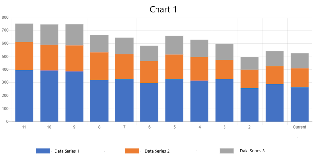
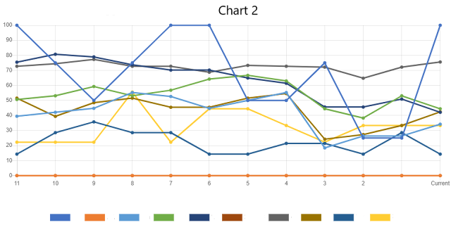
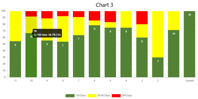
generate 3 different charts (stacked bar, line, stacked 100% bar):
|
var ChartConfig = {
"Chart 1": { Name: "Chart 1", ChartType: "bar", DataInPercent: false, stacked100: false, HasHeader: true, Stacked: true, DisplayValues: false },
"Chart 2": { Name: "Chart 2", ChartType: "line",
DataInPercent: true,
stacked100: false,
HasHeader: true,
Stacked: false, DisplayValues: false },
"Chart 3": { Name: "Chart 3", ChartType: "bar", DataInPercent: false, stacked100: true, HasHeader: true, Stacked: true, DisplayValues: true, Colors: ["#548235", "#ffff00", "#f00"] }
};
|
Next I’ll define configuration settings (I use this
configuration settings to change the urls any time):
|
var _myChartAppConfig = {
IsDev: false,
ExcelUrl: _spPageContextInfo.webAbsoluteUrl
+ '/Shared%20Documents/Graphs.xlsx',
BaseFolder:
_spPageContextInfo.webAbsoluteUrl + '/SiteAssets',
LogEnabled: true,
ConsoleLog: function ConsoleLog(msg) {
if (_myChartAppConfig.LogEnabled)
console.log(msg);
}
};
|
Showtime, now the actual angular application starts,
starting with defining myChartApp module:
|
angular.module('myChartApp', []);
|
Create AngularJs service to fetch data from Excel file:
|
angular.module('myChartApp').service('spRestService', ['$http', '$q', '$timeout', function ($http, $q, $timeout) {
var spRestService = this;
this.GetExcelData = function () {
var deferred = $q.defer();
$http({
method: 'GET',
url:
_myChartAppConfig.ExcelUrl,
responseType: 'arraybuffer'
}).then(function (result) {
deferred.resolve(result.data);
}, function (error) { deferred.reject(error);
});
return $q.when(deferred.promise);
};
}]);
|
Now we’ll create our controller to actually interact with
the application:
|
Below is the skeleton of myChartAppController with properties and
method declaration:
|
|
angular.module('myChartApp').controller('myChartAppController', ['$scope', 'spRestService', function myChartAppController($scope, spRestService) {
$scope.XLSXRange = {
row: 0, col: 0 };
$scope.dataSeries =
[];
$scope.colors = ['#4472c4', '#ed7d31', '#a5a5a5', '#ffc000', '#5b9bd5', '#70ad47', '#264478', '#9e480e', '#636363', '#997300', '#255e91', '#43682b',
'#698ed0', '#f1975a', '#b7b7b7', '#ffcd33', '#7cafdd', '#8cc168', '#548235', '#ffff00', '#ff0000'];
$scope.TransformedData
= [];
$scope.GetFileContent
= function () {
}();
$scope.TransformData =
function () {
};
}]);
|
|
I’ve defined properties for storing data returned from service (dataSeries) and then storing the transformed data (TransformedData). I’ve also declared XLSXRange for defining
the starting row and column to read from Excel Sheet and Colors array to be
used while creating chart.
|
|
GetFileContent function: in this function we’ll call our service to
get data from Excel file.
|
|
$scope.GetFileContent = function () {
spRestService.GetExcelData().then(function (data) {
//console.log(data);
var bstr = data;
var workbook = XLSX.read(bstr, {
type: 'array', cellDates: true, cellNF: false, cellText: false });
$scope.$evalAsync(function () {
_myChartAppConfig.ConsoleLog("Reading
Excel Data");
for (var i = 0; i < workbook.SheetNames.length; i++) {
var sheetName = workbook.SheetNames[i];
var chartOption =
ChartConfig[sheetName];
var sheetJson = null;
if (chartOption.HasHeader) {
sheetJson = XLSX.utils.sheet_to_json(workbook.Sheets[sheetName], {
range: $scope.XLSXRange.row, dateNF: 'DD"/"MM"/"YYYY' });
} else {
sheetJson = XLSX.utils.sheet_to_json(workbook.Sheets[sheetName], {
range: $scope.XLSXRange.row, dateNF: 'DD"/"MM"/"YYYY', header: chartOption.HeaderColumns, blankrows: true });
}
$scope.dataSeries.push({ name: sheetName, data: sheetJson });
_myChartAppConfig.ConsoleLog("Loading
Series:" + sheetName + '; Data:' + sheetJson.length);
}
_myChartAppConfig.ConsoleLog("Trasnforming
Excel Data into Chart format");
$scope.TransformData();
_myChartAppConfig.ConsoleLog($scope.TransformedData);
});
});
}();
|
|
As the service returns
the response in arraybuffer which is a binary format, so we
cannot use it as it is. We need to transform the data from binary to array.
Here comes XLSX library which reads the binary data and convert it into JavaScript
based Excel Workbook object. From that Excel workbook object I’ve extracted
the data from different sheets using sheet_to_json method
and stored it in dataSeries object. Then
used TransformData method to convert dataSeries to chart dataset.
|
|
$scope.TransformData = function () {
angular.forEach($scope.dataSeries, function (selSeries, sIndx) {
var chartOption =
ChartConfig[selSeries.name];
var cdata = { Labels: [], DataSets:
[], ChartOption: chartOption };
var datakeys = Object.keys(selSeries.data[0]);
angular.forEach(datakeys, function (k, kIndx) {
var serData = [];
angular.forEach(selSeries.data, function (d, dIndx) {
if (k == '__EMPTY') {
var labelText =
d[k].toString().indexOf(' ') > -1 ? d[k].split(' ') : d[k];
cdata.Labels.push(labelText);
} else {
var pdata = chartOption.DataInPercent
? d[k] * 100 : d[k];
serData.push(pdata);
}
});
if (k !== '__EMPTY') {
cdata.DataSets.push({
label: k,
backgroundColor: chartOption.Colors ? chartOption.Colors[kIndx - 1] :
$scope.colors[kIndx - 1],
borderColor: chartOption.Colors ? chartOption.Colors[kIndx - 1] :
$scope.colors[kIndx - 1],
data: serData,
fill: chartOption.fill ? chartOption.fill : false,
linetension: chartOption.Curve ? chartOption.Curve : 0
});
}
});
$scope.TransformedData.push(cdata);
cdata = null;
});
};
|
|
After transforming
data the TransformedData object will contain all the data
related to chart including Chart Type, Coloe, Label Text, Header Text, data,
data format etc.
|
Now we will create a directive “chartDir” for displaying
actual charts.
|
Start coding with creating an AngularJS directive
|
|
angular.module('myChartApp').directive('chartDir', ['$parse', function ($parse) {
return {
restrict: 'A',
link: function ($scope, element, attrs) {
var canvas = element.context;
var ctx = canvas.getContext('2d');
var chart = null;
$scope.$watch(attrs.chartDir, function (data) {
if (data && data.DataSets.length > 0) {
if (chart) {
chart.clear();
chart.destroy();
}
var chartConfiguration = {};
chart
= new Chart(ctx, chartConfiguration);
}
});
}
};
}]);
|
|
You might have noticed
that chartConfiguration variable is declared as an
empty object. Well this is the main object that will contain all the
configuration for creating chart and displaying it on page, user interaction
etc.
|
|
var chartConfiguration = {
// The type of chart we want to create
type:
data.ChartOption.ChartType,
data: {
labels:
data.Labels,
datasets:
data.DataSets
},
options: {
}
};
|
|
As you can see in above code ChartType, Data Labels and DataSet is
configured. With this much configuration we can display the chart. Options
provide additional functionality to the chart i.e. axis, responsive, title, legend,
tooltip etc. So in the next row I’ll show only recommended options others are
nice to have.
|
|
options: {
scales: {
xAxes: [{
stacked:
data.ChartOption.Stacked
}],
yAxes: [{
stacked:
data.ChartOption.Stacked
}]
},
responsive: true,
title: {
display: true,
text:
data.ChartOption.Name,
fontSize: 20,
padding: 15
},
legend: {
display: true,
position: 'bottom'
},
elements: {
line: {
tension: 0 // disables Bezier curves in line chart
}
},
tooltips: {
//intersect: true,
//mode: 'index',
callbacks: {
label: function (tooltipItem, myData) {
var label =
myData.datasets[tooltipItem.datasetIndex].label || '';
if (label) {
label
+= ': ';
}
var n =
parseFloat(tooltipItem.value);
label +=
(n - Math.floor(n)) !== 0 ? n.toFixed(2) : parseInt(tooltipItem.value);
return label;
},
title: function (tooltipItem, myData) {
var title = tooltipItem[0].label;
if (title.indexOf(',') > -1) {
title
= title.replace(/,/g, ' ');
}
return title;
}
}
},
plugins: {
stacked100: {
enable: data.ChartOption.stacked100 }
}
};
|
|
In the above section, I’ve defined the following options:
|
|
Details of chart configurations can be found on the ChartJS
documentation.
|
That all and you have your chart application ready to
display chart taking data from Excel.
Joining the Dots
If you are not familiar with the Angular then you might be
wondering how it’s going to take data and render the chart, where chartDir is
called etc.
Again go back to the
HTML template:
·
First div contains ng-app and ng-controller
directive initialized with our module and controller.
·
You can see there is a div with ng-repeat directive that create a loop on TransformedData array and object in series.
This directive is responsible for creating multiple div based on items in
array.
·
Inside div, there is Canvas with chart-dir directive initialised with series
object. As series object contains data that is used in generating chart. Go
back to chartDir directive and look for $scope.$watch(attrs.chartDir, function (data) { the data passed in function comes from the HTML markup chart-dir="series".
Enough of knowledge, you
might started thinking what we get after doing this much work.
Showtime


Last thing we have to do is to add a content editor webpart in our SharePoint page and provide link to this HTML file, save and refresh. Change the data in excel file and see the chart will display the updated data.
Hope you enjoyed the
article. Please leave your thoughts/queries in the comments below.


This comment has been removed by a blog administrator.
ReplyDeleteThis comment has been removed by a blog administrator.
ReplyDelete